Impetu
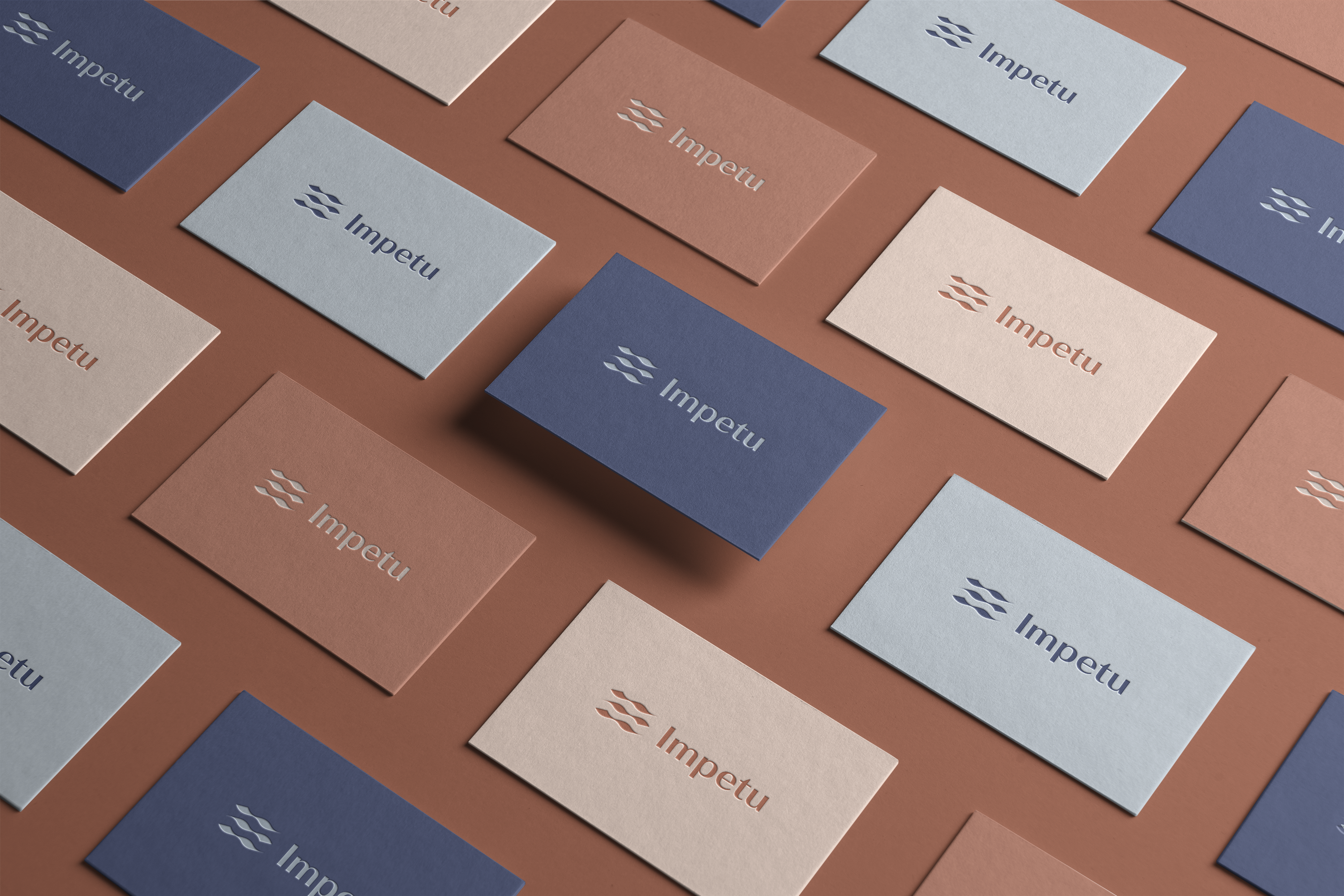
The idea for this brand design for Florin Costea, a chiropractor and therapeutic masseur based in Vienna, came from his approach to his profession. We chose the symbol of the wave, which, in the case of Impetu, represents the healing impulses given to the body during the treatment and which continue afterwards like the concentric circles of a raindrop hitting the surface of a body of water.
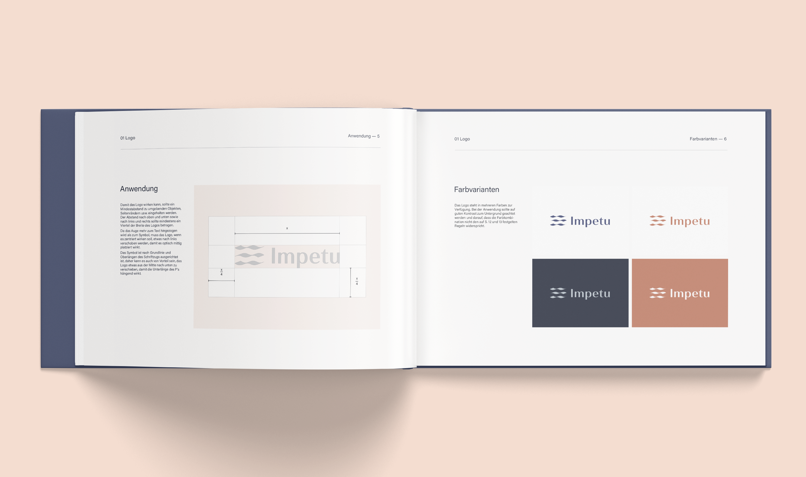
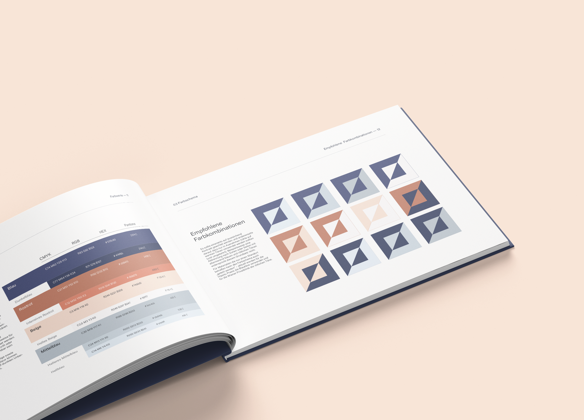
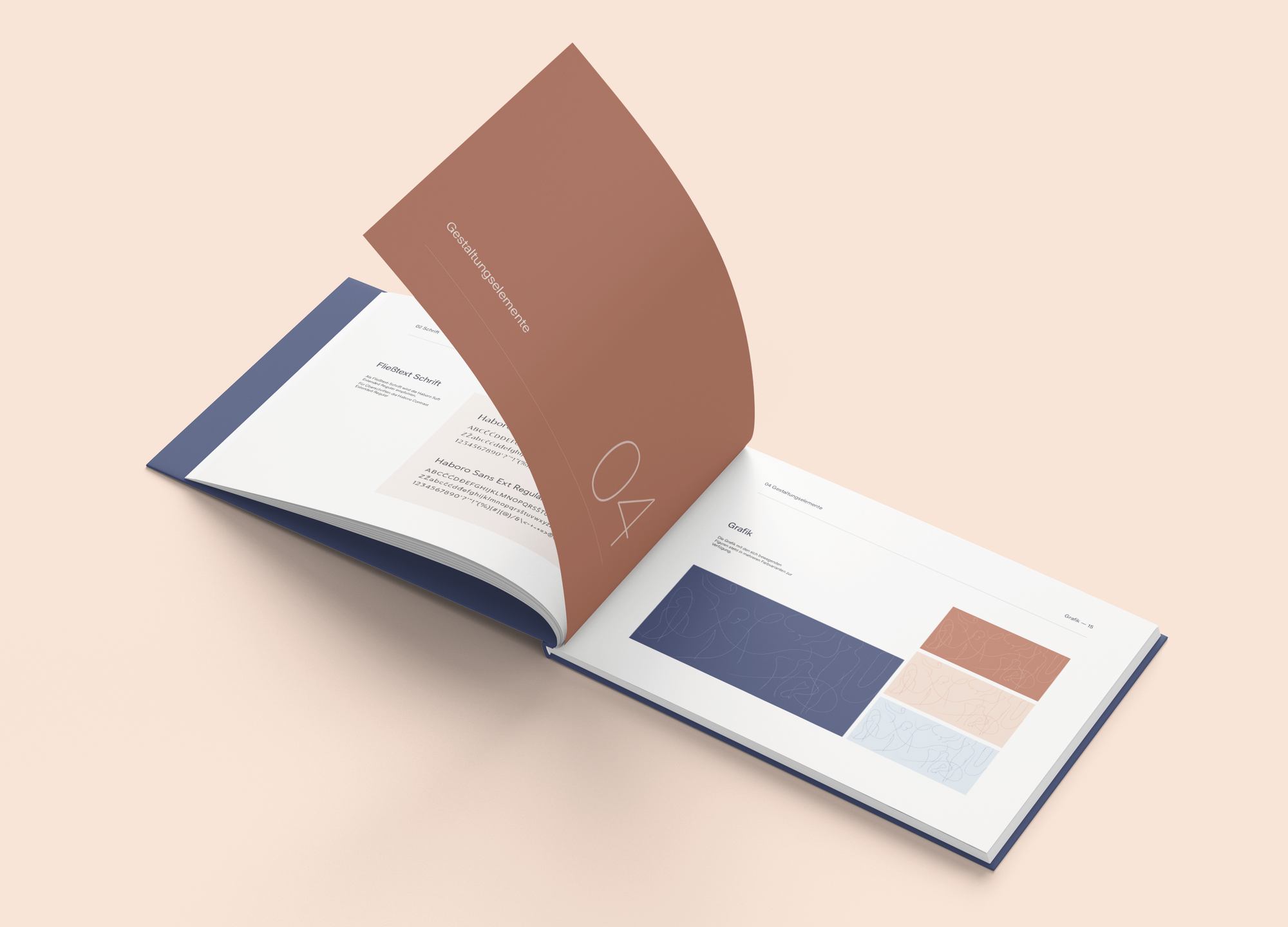
After the brand positioning and naming phase, we started with a thorough moodboarding process, aiming for a clean but warm “Scandinavian” aesthetic in both the logo and accompanying design elements such as illustrations or fonts. The soft and calming colors were chosen to avoid the stereotypical aesthetic of a sterile medical environment. For the color combinations, we again focused on clear but not harsh contrasts
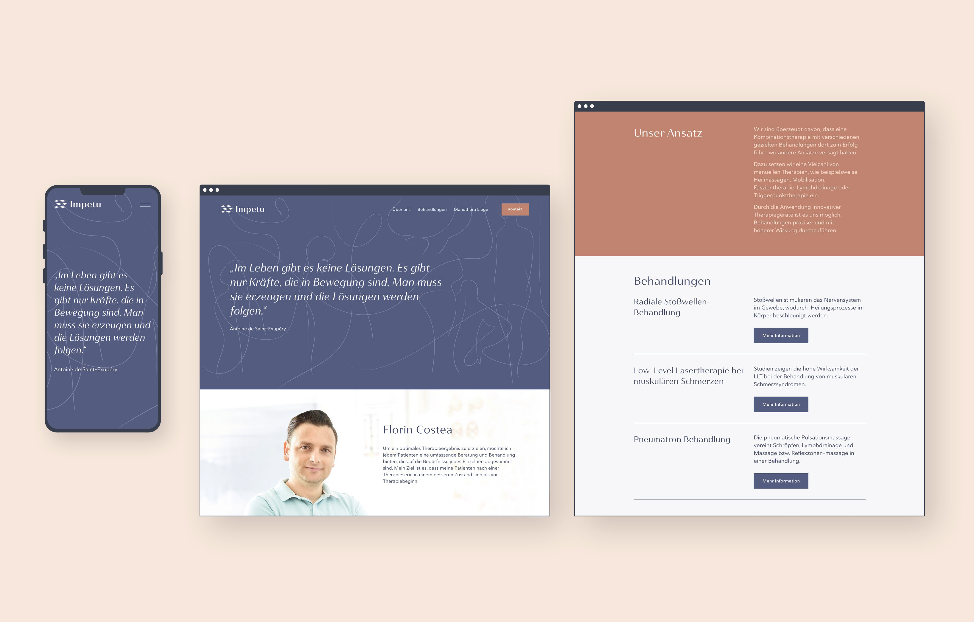
Finally, a web design based on the branding was implemented with Squarespace.