Just because we can?
In 2026 when you land on a website, you often have a completely different experience than, let’s say, in 2015. You open a homepage to check the price of the service or simply learn more about the brand. You open it, and it seems like you’ve ended up watching a movie: loading animation starts, hero animation is following, pictures are circling… you start to look for familiar patterns: “Where is the navigation?”, “Maybe there is a button…”. And as you start scrolling, the movie continues, because everybody loves the scrolling animations, right?
After such an immersive experience, you can get nostalgic for simple websites from 2015. Logo on the left, three links in the middle, obvious button on the right. It really was not always beautiful, but it was doing a job well. The job being – to give people all the information they need fast and efficient.
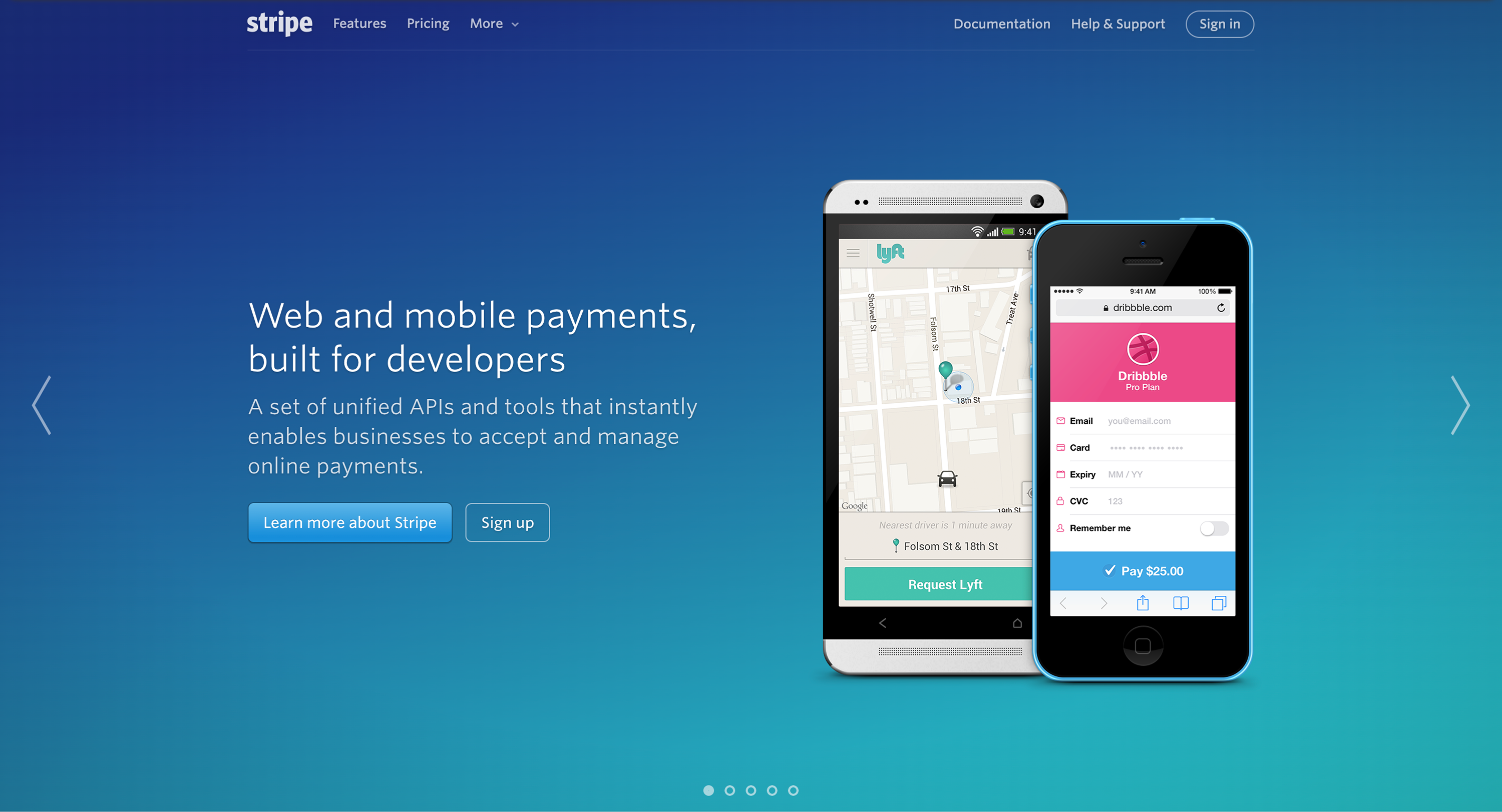
So what has changed in over 10 years of web design?
In 2015, when you built a website, you had to work with hard limitations: animation, personalization, every additional script would require the load time that you couldn’t spare. Such limitations, though on the bigger scale seen as artefacts of the older times, actually pushed people to think about what to put on the website. They could only afford what mattered and was absolutely needed.
This is an interesting thing about progress: we strive for progress, because it promises us never-ending all-is-possible technologies, that will solve every problem. No limitations! Well, in 2026 we have officially reached a point where we can say, there are indeed much fewer limitations than 10 years ago. New frameworks, component libraries, personalization engines, testing tools — the whole toolkit means that adding one more animation or one more interesting module costs very little time and effort. Anything is possible, especially in the age of AI assistants, AI agents, and AI coding tools.
How to build websites in 2026?
When anything is possible, it’s hard to stop yourself and ask: out of all of these possibilities, what can I use to build a website that is on point? A website that does its job, and is not flooded with extra decorations and quirks just for the sake of being trendy.
The uncomfortable truth is that having fewer constraints doesn’t make design decisions easier — it makes them harder. In 2015, the loading budget did some of the editing for you. In 2026, that job falls entirely on taste, discipline, and a clear sense of what the site is for. These are the websites that stand out today: where every animation, every module, every extra layer of interactivity has to justify its place.
In practice, that means a few things haven’t actually changed in ten years, even though everything around them has:
- Start with what needs to be said, not what can be shown. More tools means more temptation to lead with a visual flourish instead of the message. The message still comes first.
- Hierarchy beats decoration. A visitor should know what matters on a page within seconds, because it was deliberately curated.
- Motion needs a job to do. Animation is cheap to add now, which is exactly why it needs a reason to exist: guiding attention, revealing information gradually, confirming an action. Otherwise it’s just noise.
- Performance and accessibility are still the discipline and good practice.
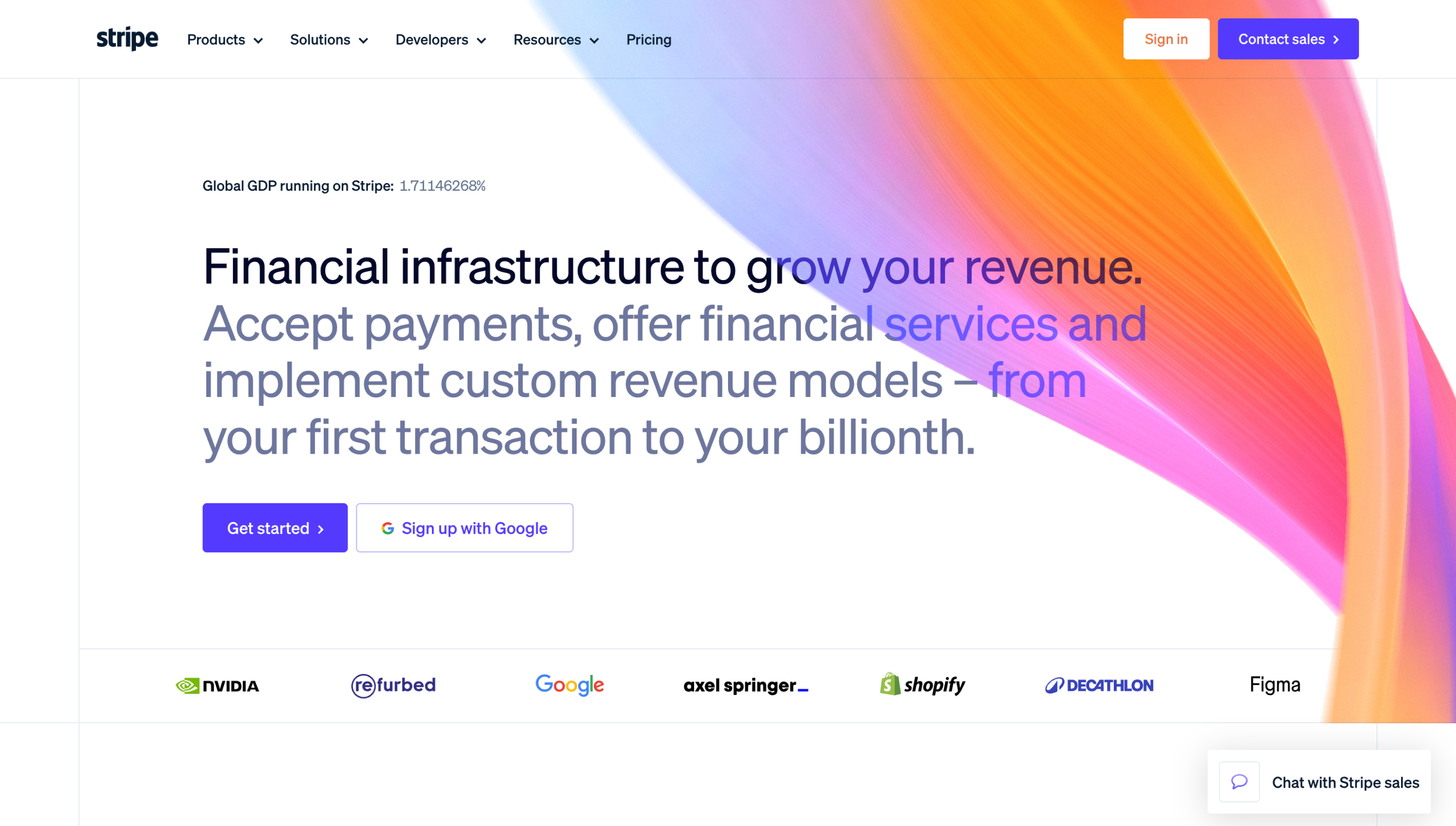
Stripe’s 2026 homepage redesign is a clean example of this. The old site wasn’t outdated, but the company had grown far beyond payments, and the site could no longer tell that story clearly. Rather than piling on more sections, the new homepage leans on a grid-based “bento” layout that reveals detail on hover, plus a striking, minimal device — a running counter of Stripe’s global impact — to communicate scale in a small and smart way.
This is really the core of our approach at Infound. It would be easy to treat every new capability — more animation, more personalization, more AI-generated flourishes — as something a website should have because it’s available. We’d rather ask what a site actually needs to do its job well, and build toward that with the same discipline and care. The result is what we aim for with every project: websites that are functional and on point, but that still feel fresh and current.
What’s working on your website, and what’s getting in the way? We’ll take a closer look. Whether you need a focused audit or a complete redesign, get in touch.