Fulbright
Redesign and Relaunch of the Fulbright Austria Website.
Strategy, Design, Engineering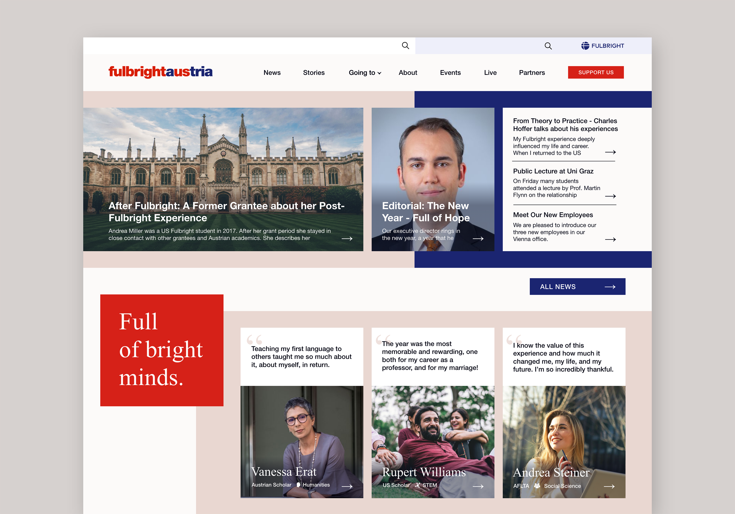
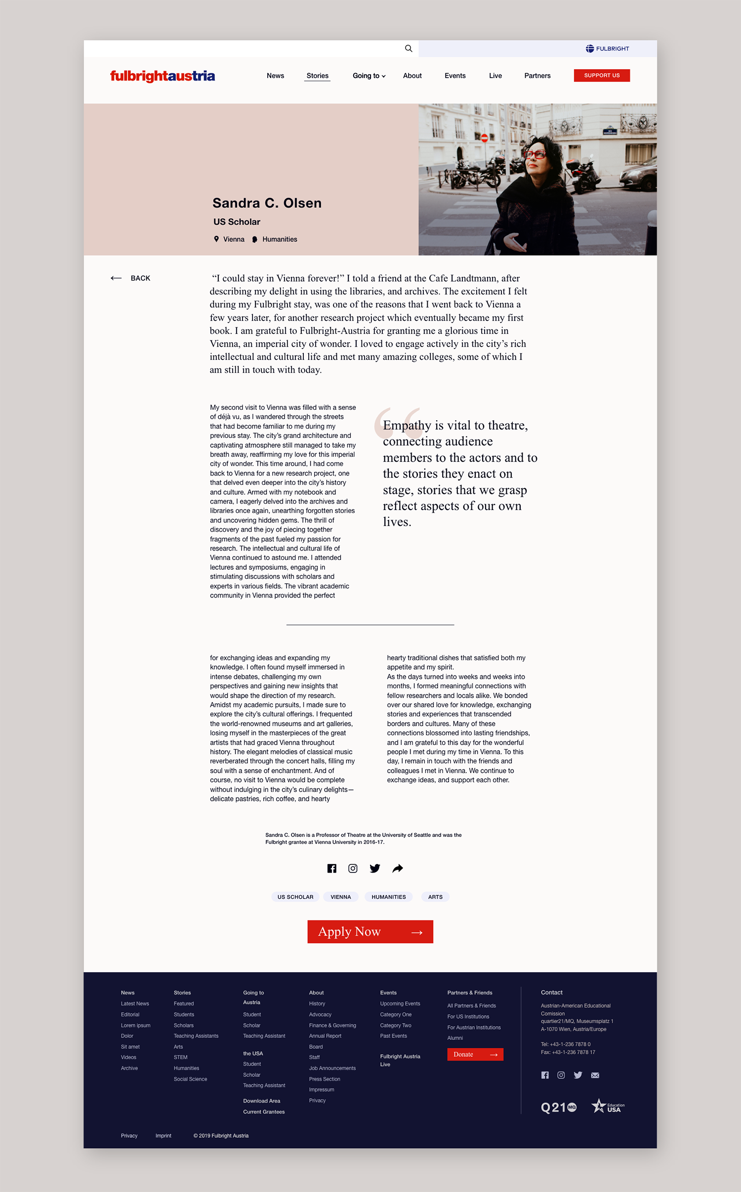
The existing Fulbright Austria website offered a wealth of information. The redesign focused on making this information more visible and accessible through the addition of a main and footer navigation, options for presenting current information and clearly defined sub-sections - while retaining the essential look and feel of the existing branding.
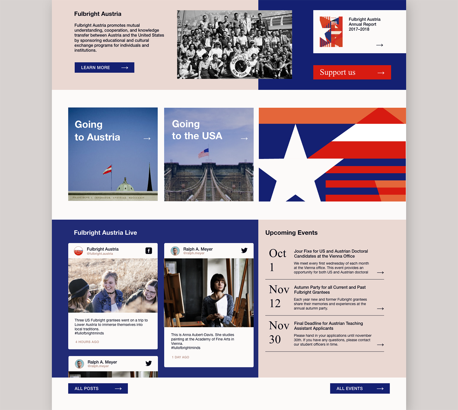
Instead of the previous reduced tile layout, we opted for a horizontal section layout for the front page. Each section corresponds to one of the main sub-pages (News, About, etc.) and acts as a display window for current and important content from that area. The sub-pages can be accessed via the front page sections or the main navigation.
The new design draws on the existing Fulbright Austria branding. We emphasised characteristic design elements, such as the combination of Helvetica and Times New Roman. For the primary brand colours, we moved the focus from red to dark blue to limit its strong signal effect to elements that need this focus (such as call-to-action buttons). We also chose beige tones - reminiscent of news paper - to emphasise Fulbright’s strong ties to its history.
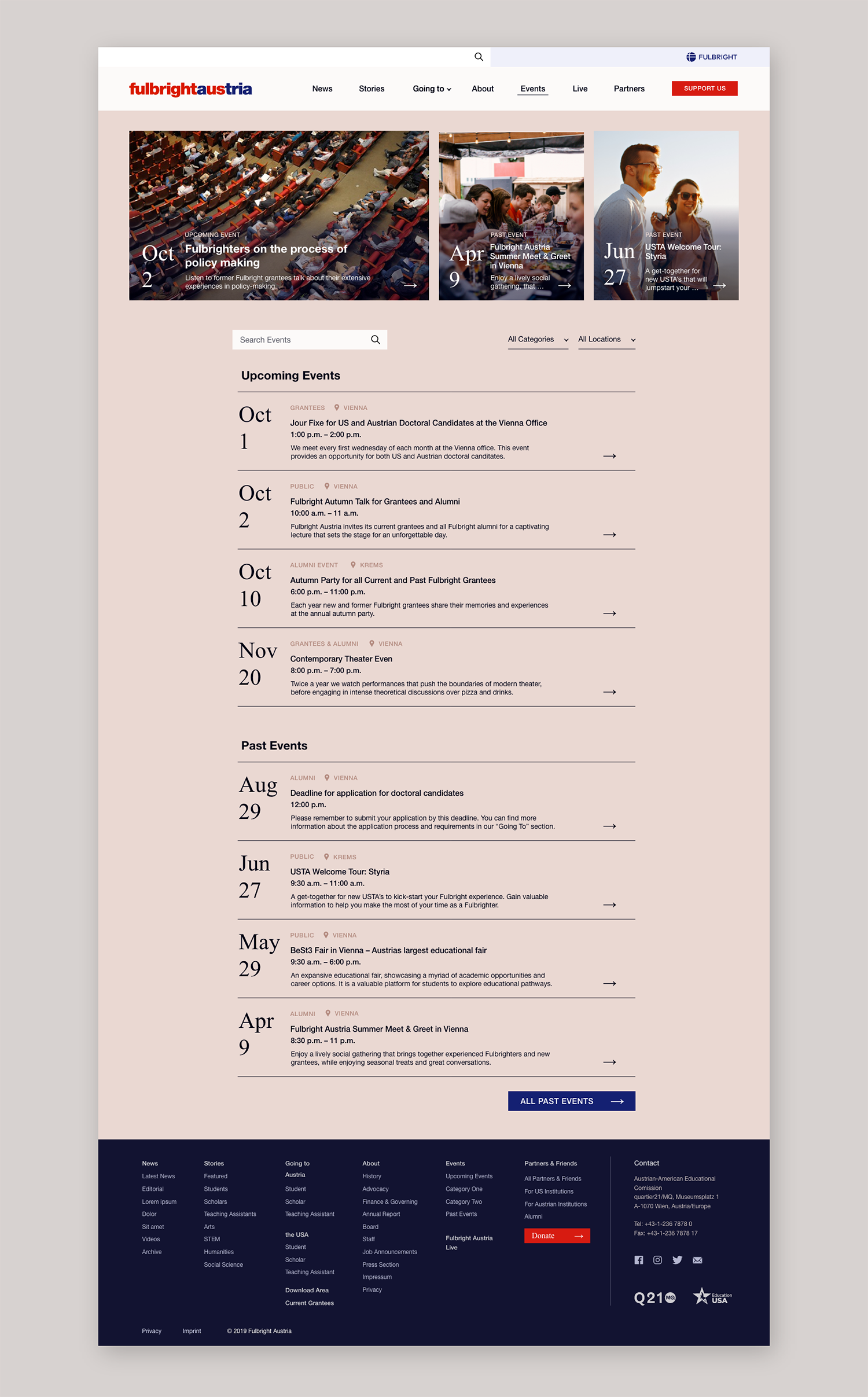
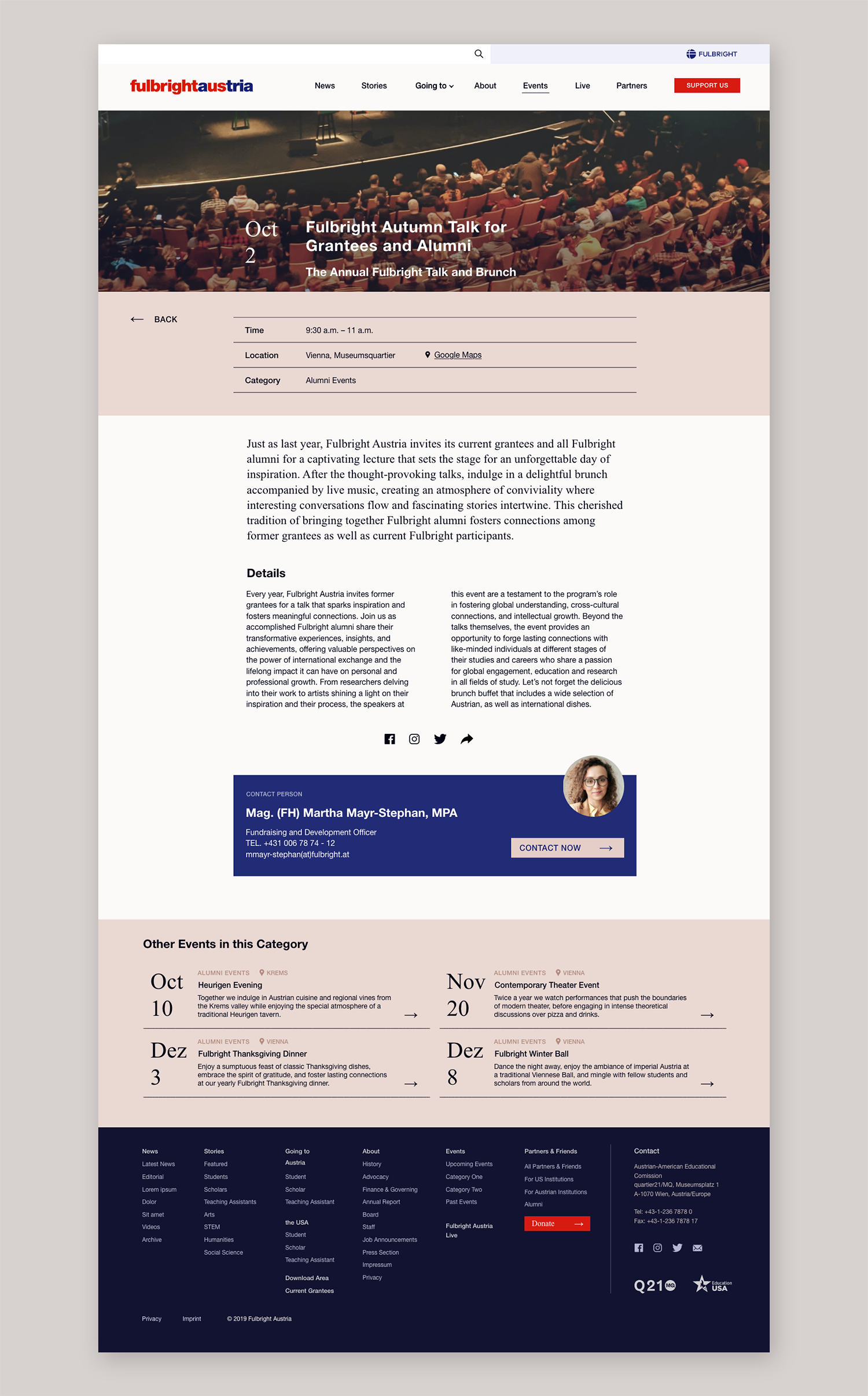
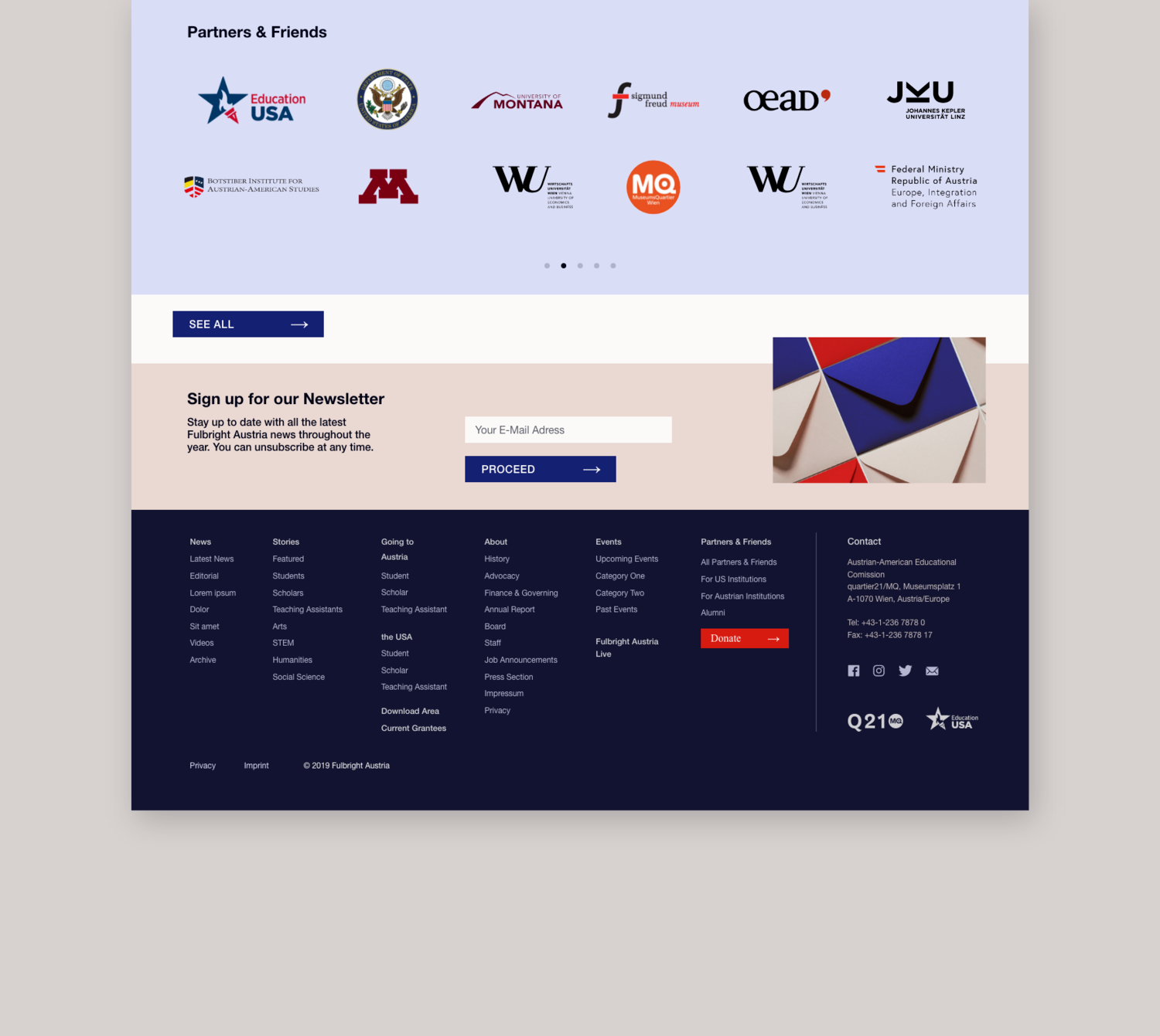
To optimise the presentation of content on detail pages, we created a number of content elements (single or double column text, citation styles, table of contents, list of documents, etc.). This allows editors to tailor the structure of each page to the content being displayed.
Check out the website at fulbright.at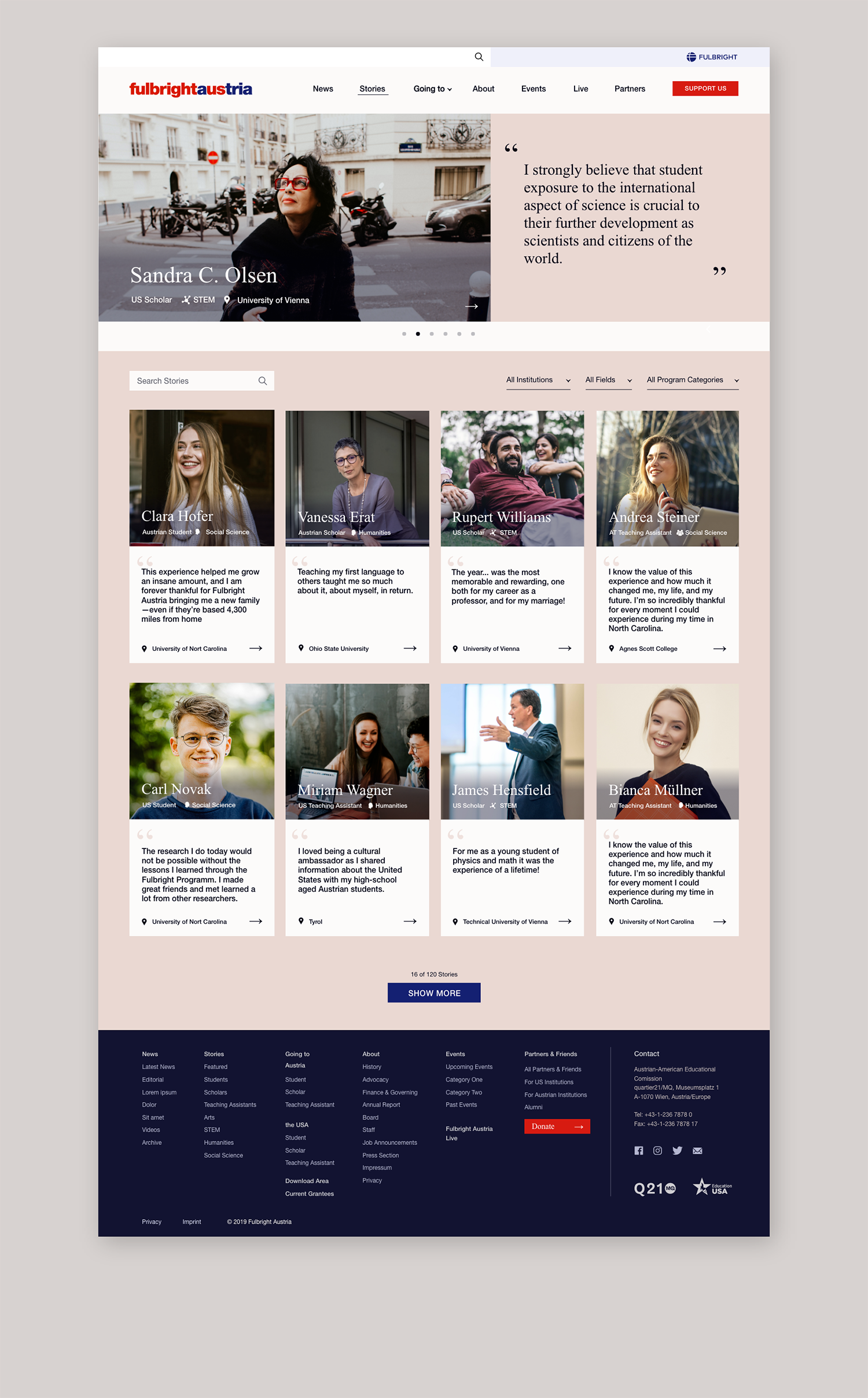
Next Project
Portego Portal
Booking, management and access solution for residential living.
Strategy, Design