lightup
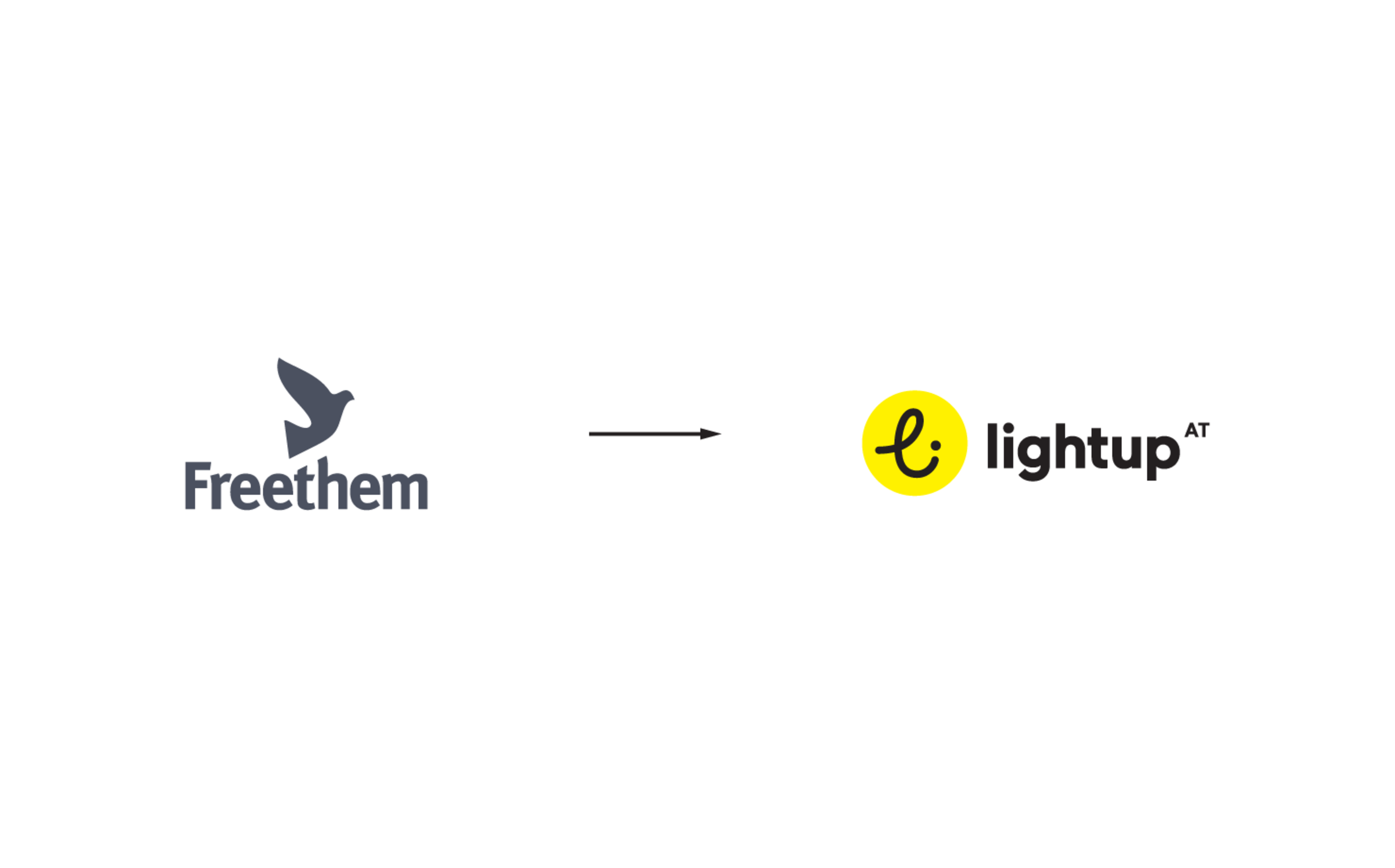
The client was a group of three country organizations of the previous parent NGO, who together wanted to take the leap and become an autonomous organization. The task was to preserve, sharpen and strengthen their essential identity and spirit and to develope a new brand out of, and around this core.
Our goal was to create a brand in the field of tension between the need for a strong identity as one international movement on one hand and autonomy for every country organization on the other hand; to allow each country and their writers and designers to operate independently, and keep them agile in catering to their young, trendy audience.
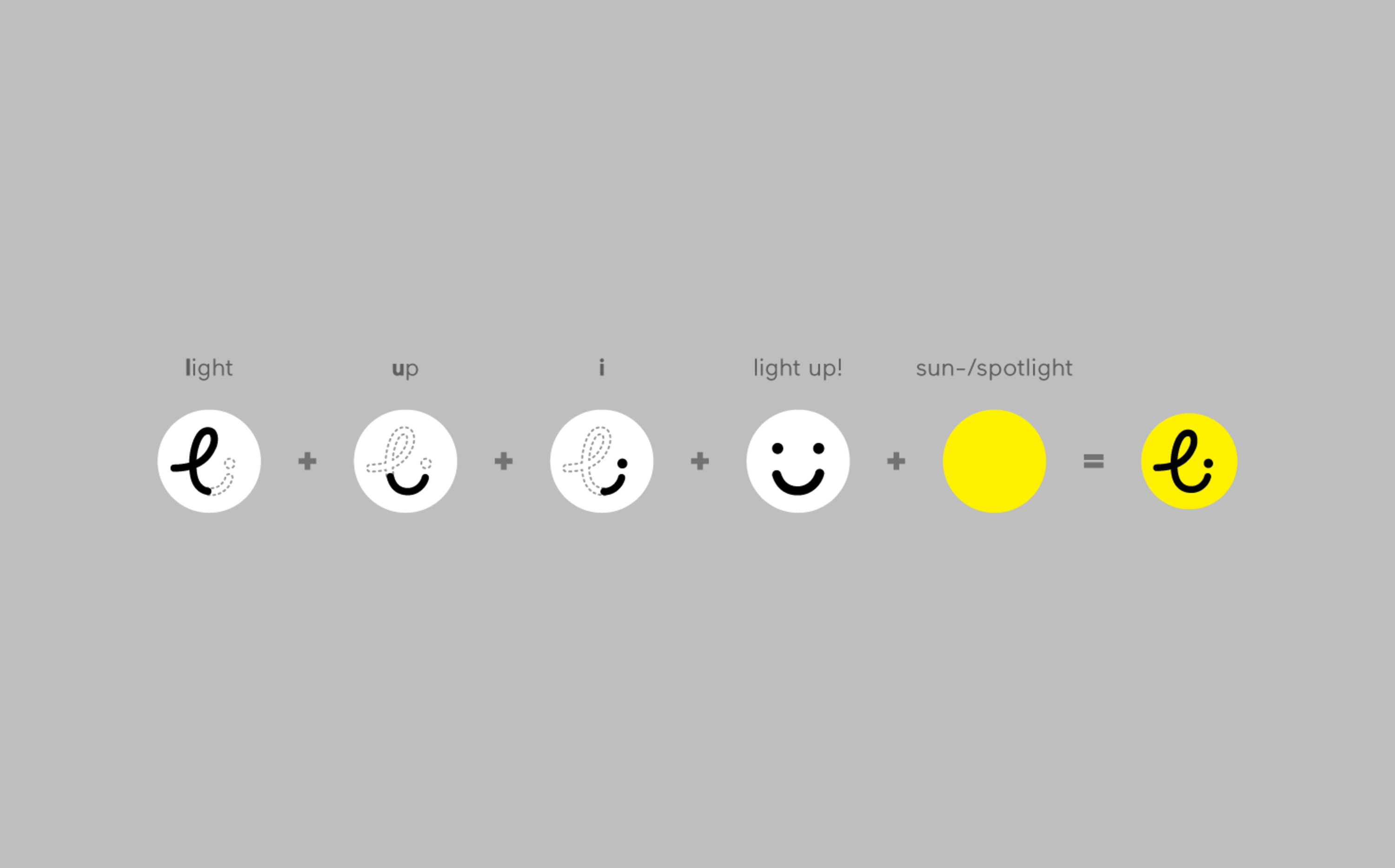
Based on the customer's distinctive positive and optimistic take on the unwieldy and difficult topic of human trafficking and sexual exploitation, we aimed for an inspiring and uplifting name and logo. We continued to develope the visual identity along this line.
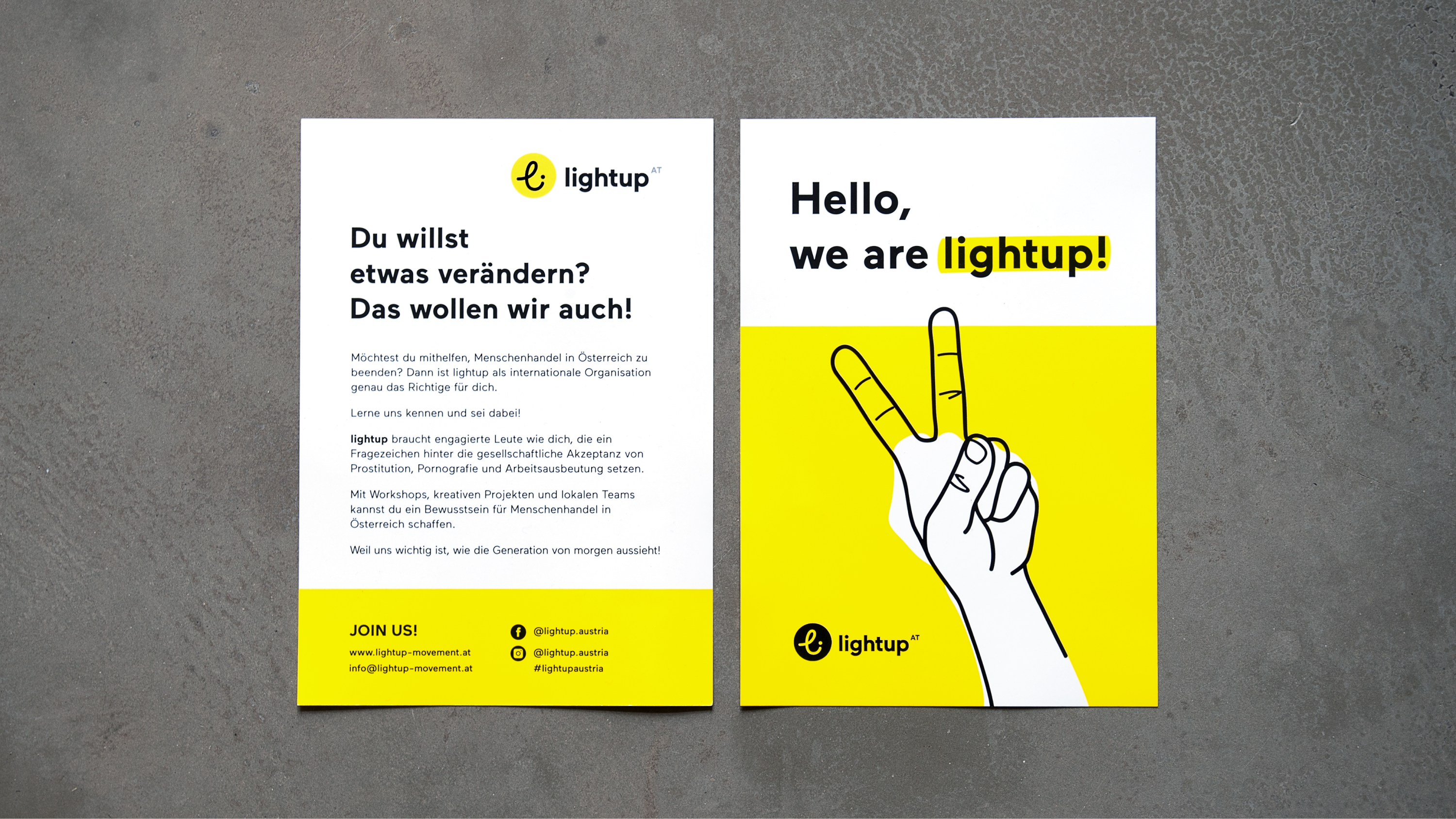

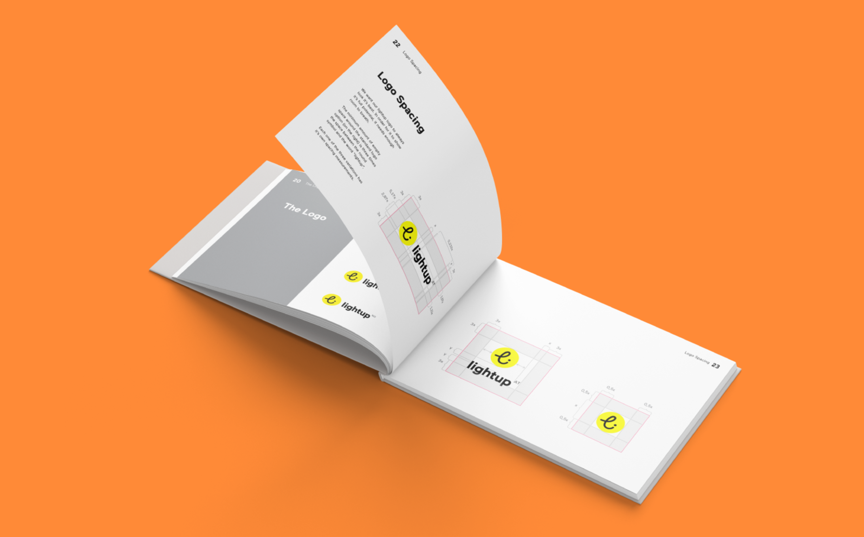
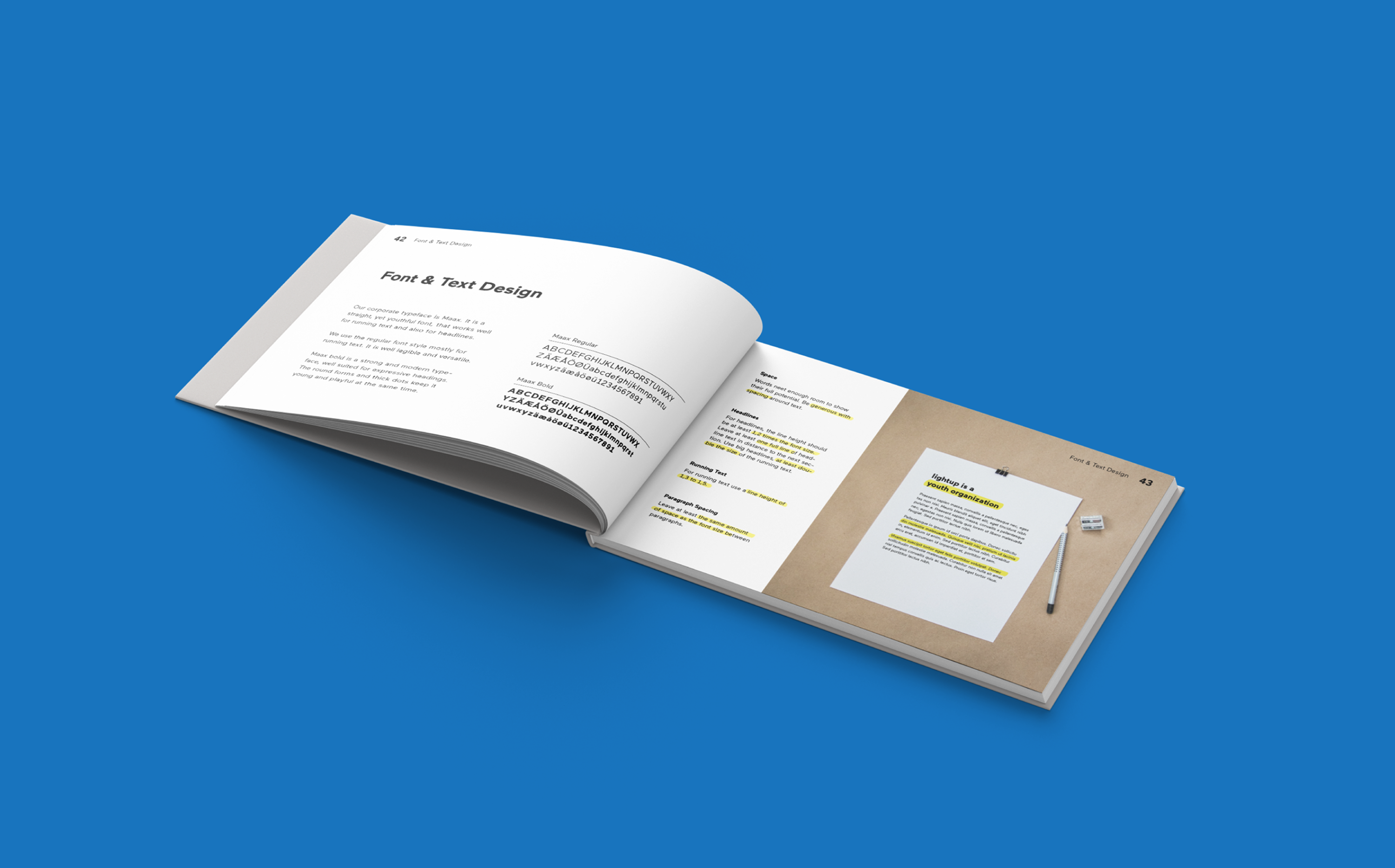
Contextual work was at the heart of the lightup project, all the more, as each country organization would manage content creation themselves. Thus, much attention was given to the brand book, as a key element in conveying the spirit, tonality and personality of the brand to the organization's writers and designers.
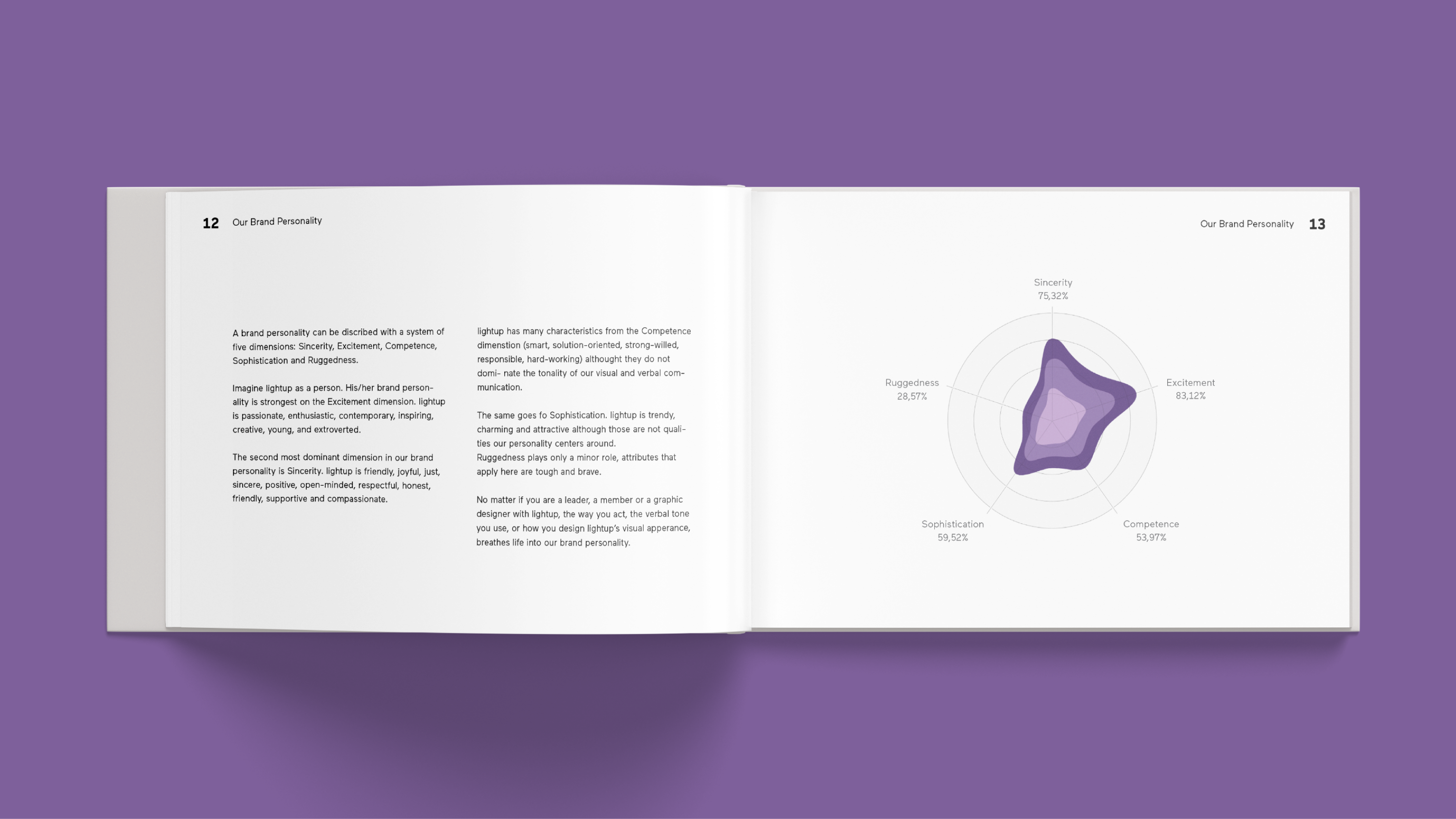
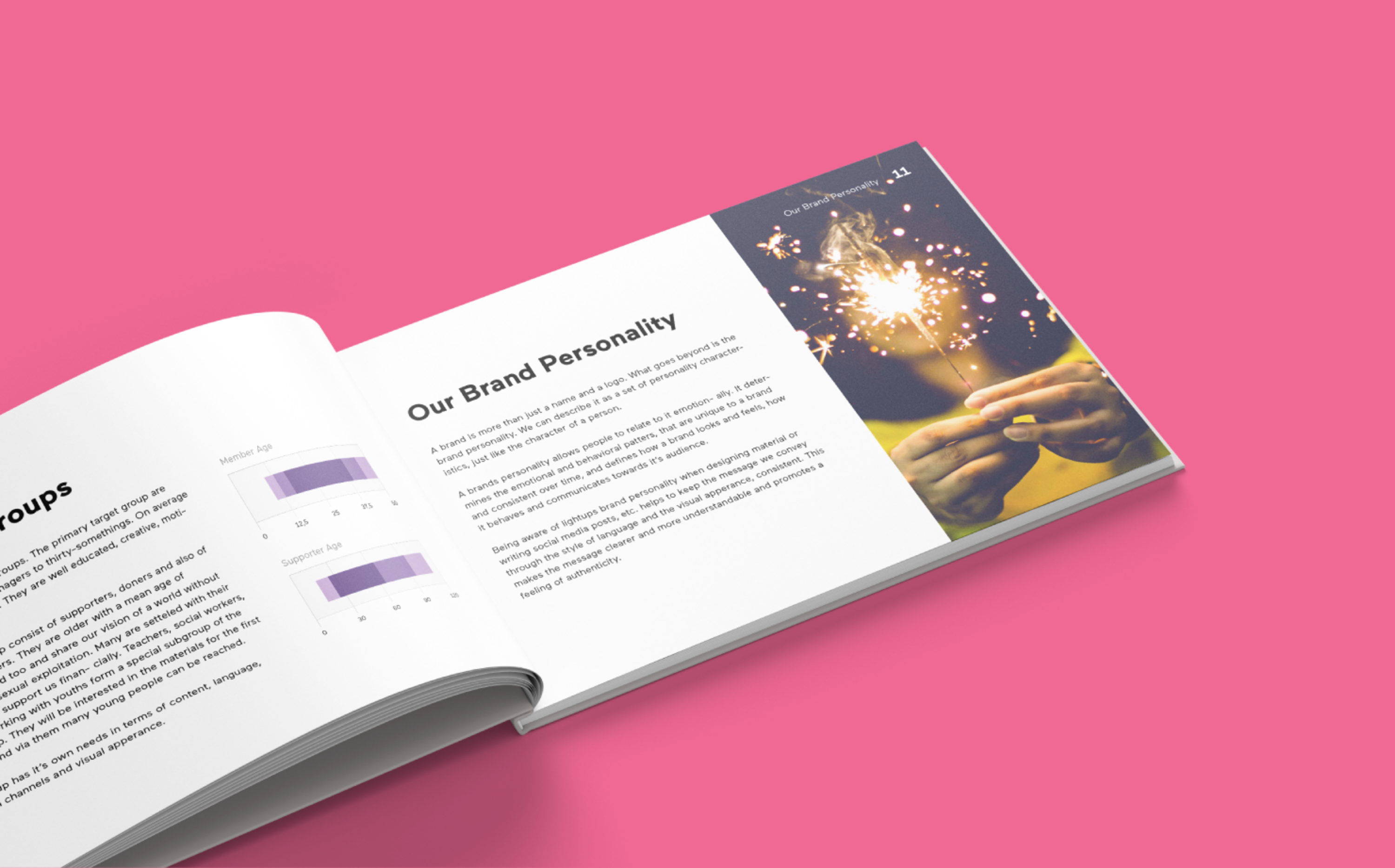
Die stark heterogene Zielgruppe von lightup setzt sich aus zumindest zwei großen Untergruppen zusammen: sozial engagierten und zugleich trendbewussten jungen Menschen mit einem durchschnittlichen Alter von 25 auf der einen Seite und Unterstützern und Spendern mit dem wesentlich höheren Durchschnittsalter von 45 auf der anderen Seite. Um den unterschiedlichen Blickrichtungen auch in der visuellen Kommunikation gerecht zu werden, wurde für die zweite Gruppe ein eigenes Farbschema entwickelt.